What is Website Readability and How Do I Improve It?
September 23, 2022
The readability of a website determines if it succeeds or fails in its intended purpose.
Creating high readability website content follows many of the same basic principles as doing it in print. However, the value of these principles is not always obvious when designing a web page. Because of this, many people may ignore them.
The result is an internet littered with countless ugly and borderline unreadable websites, many of which are holdouts from a less advanced era of web development that valued basic functionality over readability.
So, what makes a site readable, why does it matter, and how can you improve yours? Read on to find out.
What is a “readable” website? Why does it matter?
Hotjar, a website analytics company that allows customers to track user engagement with web content, defines website readability as describing how easily visitors can read and understand the site’s content.
For example, think about any time you’ve had to scan a document to find a specific piece of information. If it was easy for you to find it, then that’s a sign the document had good readability. If it was difficult for you to do it, the document had poor readability.
So why does having a readable website matter?
Because it determines how your users and potential customers engage with your site.
People have limited time and attention to browse website content, so they want to find the information they’re looking for quickly. The sooner your site grabs the visitor’s attention and leads them to what they’re looking for, the more likely they will stick around.
If your site forces them to jump through hoops just to find one snippet of information, they will click off. And chances are, they will remember that poor experience in the future and refrain from returning.
It is, therefore, in your best interest to make your website content as readable as possible.
What are the essential elements for website readability?
A site’s readability is determined by its presentation and context. Presentation concerns aspects of graphic design and how well your website leverages it. Context concerns the complexity of the content itself.
Presentation Elements
There are five main elements that contribute to a site’s presentation. These elements are:
- Hierarchy
- Contrast
- White Space
- Density
- Separators
Hierarchy
Hierarchy gives structure to website content by showing readers where to start reading and where to stop. This element sets the rules and expectations for the content to follow.
Because of this, a web page's hierarchy or lack thereof plays a large part in how scannable it is.
Features such as the organization of information, focus points, and consistency all fall under the realm of hierarchy.
Let’s take a look at exactly what each of these features entail.

Organization of Information
The organization of information is self-explanatory. Content should be structured logically, with broader topics leading to narrower, relevant ones and steps being presented in chronological order.
Presenting information in the proper order is mandatory if you want a strong hierarchy.
You wouldn’t, for example, write website content on how to perform a task, start at step 1, and then, in the next paragraph, skip all the way to step 4.
Nor would you write a blog on the life cycle of nematodes, have the first paragraph be an explanation of the larval stage, and then, in the paragraph immediately after, begin discussing the best medications to treat pets infected with adult roundworms.
Focus Points
Even if you do a great job organizing the information, readers will still get lost if you don’t install markers and waypoints throughout.
This is where focus points come in, as they are the defining features of your hierarchy.
They consist of headers, graphics, and links meant to grab the user’s attention and guide their eyes through the page, usually using techniques such as contrast, white space, and density–all of which will be discussed below.
Without focus points, you do not have a hierarchy.
One of the most common examples of a focus point is the simple header element. In the blog described above, let’s say you have a header for each broad stage of the nematode life cycle: Dung, Pasture, and Host.
Each header is a focus point that directs the reader’s attention to information about that specific life stage.
Consistency
Consistency is the final component of hierarchy. To achieve consistency, you need to set basic rules for elements of the hierarchy to follow and then stick to them.
For example, all three (Dung, Pasture, and Host) headers mentioned above hold equal weight. Therefore, they should all have the same size, color, and font.
Inconsistent hierarchical elements make a site harder to scan and, in turn, lowers readability.
Contrast
Contrast is the second core factor in whether a web page is readable. Good contrast makes reading and scanning content less taxing on the eyes.
Poor contrast does the opposite, straining the eyes and making the text harder to scan. In extreme cases, it may even render it impossible to read.
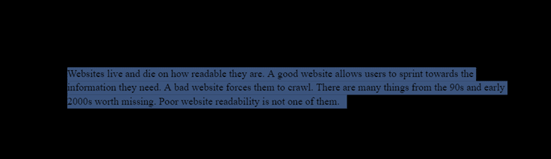
While contrast may seem as simple as using two unalike colors, the brightness and saturation of said colors also play an essential role, as the examples below illustrate. An example of no contrast, which is virtually impossible to read, is black text on a black background:

(Yes, there is text in this image. Here’s proof.)
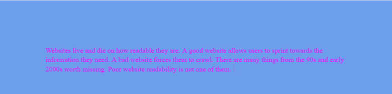
An example of poor contrast is magenta on a medium blue background. Pink and blue are on opposite sides of the color wheel and should have great contrast in theory.
However, because both of the respective shades of these colors are very light and saturated, it ends up looking like a garish, hard-to-read mess:
An example of good contrast is black text on a white background. There’s a reason this contrast scheme has become a universal standard for text:
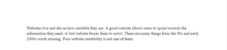
Generally, the best practice for contrast is to make the background a subtler, duller color than the text. The example of magenta on medium blue does not follow this practice, while the example of black on white does.
White Space
As the name suggests, white space is space on the page devoid of content.
When leveraged well, white space can offset long text blocks and control where the reader’s eyes naturally flow.
Margins, for example, can help to contain and separate content from other graphical elements of the site. This keeps things neat and clean, forcing eyes towards focus points.
Density
Density describes the number of words concentrated in a given space on the page. The density of a passage greatly affects its readability.
Content that is packed too tightly or too far apart is harder to scan through. The key to managing density is to find a balance.
Density is affected not only by the context of the content but also by presentation factors such as:
- Font style and size. Both have noticeable effects on density. Smaller and more compact fonts allow more words to be typed into a given space, while larger ones allow less.
- Line height. This is the space between individual lines of text. Increasing line height will naturally spread out the text and make it less dense. Decreasing does the opposite.
- Line length. This is the number of words per line. Good line length allows the reader’s eyes to flow easily from the end of one line to the start of the next.
Separators
Separators are used to divide text. They help manage text density and enforce hierarchy by leveraging elements such as white space.

The simplest and most ubiquitous form is a single line break dividing paragraphs.
Dividing website content into boxes is also a popular method.
While this can be done with simple borders, it is more effective when the boxes have a different background than the surrounding page.
Context Elements
According to Line25, a go-to resource for helpful tips for managing the context of your website content, the most important aspects are the complexity of the language you use and the scope of your audience.
As a best practice, sentences should be kept short and written in plain, simple language. They should also use active voice as much as possible.
This makes the text not only easier to scan but easier to understand as well. Needlessly complex vocabulary and wordy sentences will hurt a site’s readability.
Line25 suggests targeting different grade reading levels, depending on your audience:
- Sites aimed at broader audiences should target an 8th-grade reading level.
- Sites aimed at more educated audiences should target a 12th-grade reading level.
There may be times when it’s more beneficial to bend these rules and tailor content to use the same language as your audience.
This generally applies when a site is targeting a specific niche or industry where more complex terminology is hard to avoid, such as a site specializing in selling high-end golf equipment. In such cases, your audience not only understands such terms but likely expects to see them being used.
How do I implement these for myself?
The first step to improving the readability of your website content is to take an honest look at the design you’ve chosen, using the presentation principles above.
Does your current hierarchy organize information thoughtfully, use focus points well, and keep everything consistent?
Is your contrast easy on the eyes or garish?
Are you using white space and other separators to help control the density of your website content?

It’s a good idea to get a few more pairs of eyes on your site if you designed everything yourself. After all, it’s more challenging to critique one’s own handiwork than that of others.
Even if you hired out the design work for your site, getting other opinions is still wise. You could even go the extra mile of setting up a survey asking visitors what they think of the site’s design, how easy it is to find what they’re looking for, and other feedback.
When evaluating the context of your website content, readability tools like Hemmingway, SEMRush SEO Writing Assistant, or the Web FX readability test are the way to go if you want it done immediately. They’ll review aspects of your copy like the reading level, sentence structure, and hard-to-read sentences.
If you’re confident in your abilities to write copy, you can take this feedback and implement it as you edit.
If you’d prefer more personal assistance or want to hire someone to handle the entire process, consider hiring a writing agency.
While a writing agency can handle context elements like hitting a target reading level, tailoring things to niche audiences, and writing concisely, many also regularly handle document design aspects.
Since implementing readability for print and website content shares many principles, a writing agency is uniquely qualified to help you shore up both aspects of your website’s readability.